Showing posts with label land art/urban. Show all posts

Monday, 31 October 2011

The Political Sight - Konrad Pustoła's 'Views of Power'


What do you see?

This, here, is an image of power.
Pure and simple, it is what a specific person with power sees. Out of the window. Every day.
Some of the Views of Power, a project by Konrad Pustoła, could be postcards. They are annoyingly nice. Others - most of them, actually -  seem violent in their chaotic setting.
And so, the game begins - can you match the picture to the person? Does it tell you something more about who the person is? Or is it vice versa - the person informs your view of what this view is?

After taking the pictures, Pustoła posted them on billboards in every possible corner of the city.
No, it's not about the contrasts. It's not about looking for contrast. Rather, it is about asking yourself, what is this power? What does this view have? Do I want something from it? What could I possibly want - and expect - from this? Each context is a confrontation of one view with another. It shows the complex web of relations that go beyond a simple decision-making process. For it is clear, here, that we are part of this world of power to a much greater extent than we might think. We co-define it. Which makes it less surprizing to discover the familiarity of some of these views.

One of the most exciting aspects of this project is perhaps the most obvious one - why this window? What is this person's power? It's like trying to discover what are the superpowers of some superhero - only here, there is no super. The power is quite real. It can be power over the soul, the body, the political body. But we can name it, one way or another. And through this simple choice, of deciding this is a person with power, Pustoła provokes us, saying, look, I've made my choices, those are the views I associate with power, here and now, where are yours?

The accent on our capacity to choose power comes across even in the formal approach: these pictures are not attempting to be particularly nice, or ugly. They aren't shot as panoramas, which could seem an obvious solution. But a wrong one. It would suggest that the picture sees it all - that there is, indeed, a panorama. The "standard" angle is a political choice. It tells us clearly, this is the view. The limits are part of this game. They provoke us, ask for alternatives, answers, consequences other than the ones we already have. The billboards set the record straight: if power is always symbolic, the symbol requires context more than scope. The choice, and hence the power, is sharp as a small and precise frame.

There is one more aspect of this simple and effective work.
It was made locally. I was told the plan is to have the scope broadened. I like it as it is. It was made in one Polish city - Krakow. It is the third largest Polish city. Not the capital. Not the center. Neither the periphery. It is one place in the world. And a few windows. Where's the power? In the view, of course.
The views, in order of appearance, belong (?) to: Wisława Szymborska (poet and Nobel Prize Laureate), Magdalena Sroka (v-ce President of Krakow), Jerzy Meysztowicz (businessman), Andrzej Wajda (film director), and, below two of the pictures on billboards, cardinal Stanisław Dziwisz.

Friday, 2 October 2009

After a conversation with AB

Apparently, the National Railway Workers installed a handrail on Richard Serra’s sculpture in Duedingen, Switzerland. Why would anyone want the autonomy of the artist?

(via)

Saturday, 11 July 2009

Anthill sculpture

It's my birthday, so today I'm leaving you with some new art that was not meant to be art, made by a scientist in collaboration with ants... (Don't mind the off-screen commentary and enjoy the visual ride).


(If you're interested in the ant-not-art part of it, you can see the 6-minute documentary episode here)
(Thanks Pusty!)

Tuesday, 7 July 2009

Surfacing

Remaining on the surface is challenging.
Going deep means losing the precious cristalline equilibrium of form.
Going indepth means losing the surface tension, the attractive property, as Wikipedia nicely put it.


Picture one is
Leak, from an ongoing project by the G&V (with credits to Matthew Chokshi) The second picture is called Z. and is by Lin Zhipeng, aka "No.223".

Tuesday, 5 May 2009

Love, Art and Coimbra


Coimbra, a city in central Portugal, has one of the most beautiful - and creepy - love stories ever to be heard. It is the story of Pedro and Inês, a Portuguese heir to the throne and a Spanish aristocrat's maid. It has a tragic ending, much more gruesome than Romeo and Juliet (Pedro's own father, king Afonso IV, fears a political scandal and has Inês assissined), and contains what is one of the most extraordinary episodes in royal history: Pedro, besides declaring war on his father, declares he had wed his lover in secret shortly before her death, has her body exhumed and placed on a throne, and has the entire court kiss the dead girl's hand as a sign of loyalty to their sovereign.
Inês spent her last years in a Monastery in Coimbra, and the city is to this day associated with romance.
Now, what is particularly enjoyable in the story you are about to read, is that it happened in the same town, and yet, none of it ever meant to deal with the legend. It is but a simple story of two people. One of them happens to be the architect and artist Juan de la Mora.


"These hearts were painted by my girlfriend and I in Coimbra, Portugal a couple of years back. She is from Coimbra and I am from Chicago and we've been able to maintain a long distance relationship for the past 2.5 years. Since then, we continue to paint some of these hearts every time we are together in Coimbra. What is interesting about Portugal's Calçada (sidewalk), is that you can take a combination of a minimum of three stones and find the shape of an abstract heart form. The heart can grow by adding more stones to the original three."

Monday, 6 April 2009

Dress-up

Two ideas for an eye-opening surrounding:
Chris&Ruby's Footies, socks for your chairs

and TRASH:Any Color You Like, a rapidly growing project by Adrian Kondratowicz, based the simple idea that trash bags are also sculptoric forms.


(via)

Monday, 23 February 2009

Robin Hood Above

The artist going by the name of Above made this stencil in Lisbon. (I actually know the lady sitting on the right - she is one of Lisbon's classic characters). In a gesture the artist herhimself admits robinwoodesque, Above is selling prints of this picture and will give all the profits to two charities she has previously selected. More info here.

Sunday, 22 February 2009

The Actors - Reconnaissance, by Wojtek Ziemilski


This is a short fragment of my work called The Actors. The first volume - Reconnaissance lasts 50 minutes. You can see this excerpt in sort-of-HD here.
Any galleries interested in showing this work, write me, and I'll send you a DVD.

Tuesday, 27 January 2009

A performance by Public Movement in Łódź

UPDATE (4.February):
Public Movement is an Israeli performance group. The action you see below was made by them in Łódź, Poland.
A short explanation: before WW2, Łódź used to have a very large Jewish minority. The Jews were, among others, the owners of a significant part of the textile industry thriving in the city. Today, there are practically no more Jews there - and no more industry as well (although the industry did go on until the 70's, I believe). It is a poor and degraded city, with a lot of social problems, and where antisemitism is still present (although the vast majority of the inhabitants have never seen a Jew).
It is one of the very few places I know where one can still find antisemitic slogans on the walls.
So here you have it: the Israelis arrive and correct the Star of David. They basically make a grafitti of how it should look like, and put the correct form over the incorrect one.

And a few little ideas:
- The grafitti they choose to work with are not openly antisemitic. They simply replace one of the letters of the name of a soccer club (ŁKS) with a Star of David. So this is a "neutral" correction on a "neutral" sign.

- The ritual. Ah, the ritual. Turns it all into an action of purity. Precious.

- Notice one other, much more hidden, interpretation: the Jews are back in town. They are here, after our land. They put their stamp on the walls. They claim what is theirs (the club, the building). They are tagging their city.

- But one idea I think is crucial, and might be overlooked in all this will to interpret every single aspect of the work. Public Movement seems to be saying "Yes, this is who we are. We see no reason to be ashamed of it. Do you? Are you not embarrassed to have thought this was inappropriate or even silly, in any way?"

This is some brilliant playing with street art, semiotics, identity and politics.
The one question that I find problematic is - yes, this is on the spot. But for whom? Who is the audience? Is it public art, or just private art in public space? Or maybe it is public art, only for the audience that is reading about it now? So where does that leave the people who walk by this daily? Do we expect them to have a surge of initiative and paint over the whole signs? Or are we, deep inside, enjoying the fact that it's still there, everything is just the same, while we, the smart ones, know and watch?
I really do not know. I do not have better solutions. This, of course, is not a solution either - it is highliting the question(s). But what are we to make of this insistent neutrality right in the middle of a political issue? Is it a curse, the curse of constant distance? Or the blessing of a delicately balanced gesture, for once?


Monday, 5 January 2009

Facing Failure. A visit to Bethlehem

Tragedy has a way of playing ironic games that we only begin to understand once it's too late.

About a year ago, I wrote about a project called Face2Face, by two artists who go by the pseudonyms JR and Marco. The simple idea was: bring people to see how similar they are, and how funny. Show the two sides their faces. A charming, courageous project that meant to show the urgency of seeing the other.

That was one year ago.

A few days ago, on December 25th, I visited Bethlehem, the capital of the Palestinian Autonomy.
When entering the city, I discovered street art I had written about.
And the site was sad.


It is true, the works survived on the walls for quite a while. But especially in the case of some of the portraits, the damage was more than just a random act of destruction.

It made me feel like that particular project failed.
Possibly, someone still got influenced by it. But the statement it was making now was much stronger, and seemed to correspond better to the tension. And to increase it.
Among the many question that arose, one came back often: isn't this ridiculous, to think you can just put some funny faces on both sides of the wall, and people will feel closer to each other? You know, We Are The World... Here is what the artists were saying in 2007:

In a very sensitive context, we need to be clear.
We are in favor of a solution for which two countries, Israel and Palestine would live peacefully within safe and internationally recognized borders.

All the bilateral peace projects (Clinton/Taba, Ayalon/Nussibeh, Geneva Accords) are converging in the same direction. We can be optimistic.

We hope that this project will contribute to a better understanding between Israelis and Palestinians.

Today, "Face to face" is necessary.
Within a few years, we will come back for "Hand in hand".

Hand in hand? Today it's tempting to ask, so what does each hand hold?
What is left for the artist? This cute idea of the artist being a social engineer can look ridiculous in the face of the violent tragedy we're witnessing. The Greek tragedy appears in all its seemingly unsolvable power.

But what made this particular artistic project end up like this?
1. It felt like it was a declaration: we don't think you're funny.
2. Maybe it said: your language is not ours. You have no clue about us (but implying: and we - about you).
3. But let us go back to the face. The French philosopher Emmanuel Levinas said that
the face says to me: you shall not kill.
Is that why the work was torn? In a way... I would be tempted to say that Levinas gives a reason a little further in that interview:
Accordingly, my duty to respond to the other [because of being confronted with his face] suspends my natural right to self-survival, le droit vitale.
Ergo, a work showing the faces of others can somehow take away my power to consider myself ahead of the other, leaving me at their mercy. They are facing me. In front of me. (Laughing at me?)(Mocking my way of life? My seriousness and attachment to my culture? My people's suffering, maybe?) By looking at me, constantly, they demand recognition that goes beyond any recognition they can give me.

Yes, this seems like a dead-lock. And a sad time, also for art.


One desperate attempt at a positive note.
Not all ancient Greek tragedies ended badly. For instance, The Eumenides, the third part of Aeschilus' trilogy Oresteia, ends well. It is Athena who comes and convinces the goddesses of vengeance - the Furies - to accept a judgement democratically made by a jury. Athena renames the Furies (Erinyes) the Kindly Ones - Eumenides. (And everyone lives happily ever after.)
Can we paint ourselves into being Athenas? We'll keep on trying. But we could certainly use some of those sound democratic judgements to defend.
Selected fragments of Levinas on the face:
The face resists possession, resists my powers.
The face opens the primordial discourse whose first word is obligation.
The Other faces me and puts me in question and obliges me.
The face is exposed, menaced, as if inviting us to an act of violence. At the same time, the face is what forbids us to kill.
The manifestation of the face is already discourse.

Declassifying the data, right on the street


One of my points of interest recently has been the social identity and its various levels (going from such a broad thing as being a citizen to being a "part of a relation").
This is what the author, cirka, says about the work, on the Wooster Collective site where I discovered the work:

"I've been thinking a lot about public information vs. private information and why it's so fascinating to read about the mundane details of someone else's private life (like finding their grocery list that they dropped in the parking lot, for example). So, I decided to reverse this by choosing "declassify" some of my own personal documents: letters that, at a different time in my life, I would have been mortified for anyone else to see. All are letters that were written to me (except for one, which shows a short email correspondence). They span from a letter written by my pen pal when I was about 10 to a letter that I received last summer. I silk-screened all the letters in the original color that they were written in. The only things that I altered were the names of people mentioned in the letters, which I censored in black ink."

I love when an artist plays with the idea of a genuine self, flirts with exhibitionism, and yet the work remains a presentation, a mise-en-scene.

Wednesday, 26 November 2008

Of Delicate Pride - Jorge Rodriguez-Gerada

The Wooster Collective published an interview with Jorge Rodriguez-Gerada. The answers to the following three questions are a brilliant introduction to his work. (My favorite, of course, is the third answer.)

Wooster: What other artists do you most admire?

I admire artists from different periods because of how they have impacted me at different times in my life. Leonardo da Vinci, Jean Giraud, Marcel Duchamp, John Heartfield, Ana Mendieta, Chris Burden, Barbara Kruger, Mark Pauline, Christo and Jeanne-Claude, Joseph Beuys and Anselm Kiefer are each a little part of me as an artist. With my contemporaries I would have to say that Swoon, Blu, and Marc Jenkins have impressed me not only with what they say with what they create, but also because of who they are as people.

Wooster: How would you describe your art to someone who could not see it?

My art is usually found within the urban landscape. City textures are my favorite background for my work. I like to work with ephemeral materials. One of my directions is to create large charcoal portraits of anonymous people on inner city walls that fade away with the wind and rain.

Wooster: What other talent would most like to have?

If I had another lifetime to devote to something else I would probably be an archeologist.


There is one thing about these portraits from the Identity Series I find awe-inspiring. They are modest. They bring forward the anonymous faces in a way that inspires both empathy and awe. They put them forward, fighting the war with commercial works as well as any. And yet, they are not shining at us with attractive colors. Their truthfulness is more than honest. It is humble. And yet - proud. And one more crucial thing: these faces, they fade away with time. This rare combination of grandiosity and modesty is something truly impressive.

Which brings us to Rodriguez-Gerada's latest project, the one most of us came to know him for.
He is the author of a huge portrait of Barack Obama (although actually the work is still not finished). But I think this has received enough publicity already. Appropriately enough, the work will be called Expectations, and is yesterday's news even before it inaugurated. Which tells us as much about the reception of directly political art as about the work itself. (On the other hand, this expectation is also about preparing the desinchantment, isn't it?)

Two documentaries about Rodriguez-Gerada's work in Spain:

Wednesday, 1 October 2008

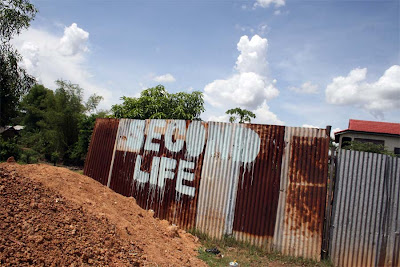
Where is MySpace? Filippo Minelli's "Contraddictions"


Filippo Minelli, Contraddictions series (ongoing)
The ones I really like are the ones playing with the double meaning: DOUBLE LIFE, MYSPACE. But if they were left by themselves, I supposed I would have found them annoying. Too simple, too propagandesque.
Here, however, the artist creates a context, creating a whole network of worlds we know very well - from somewhere else.
And among those, the ones I really appreciate are the virtual worlds. YouTube written on an old wall in Phnom-Penh is great, because one of the things it says is: this is not virtual. This is here, it is a real place... And of course, as it is doing it, the contrast appears.
I only wish there were less photos, less brands. Otherwise, the entire set might seem a bit too vast, fleeing into the vagueness of the global companies.


(via)

Monday, 22 September 2008

Finishing off the Flesh Series


Found at Rebel:art among other (excellent) participants of the International Sticker Awards (to be announced on October 3) is this wonderful example of product sabotage, by Thomas Judisch. The sticker simply says "free sample". You can agree with the ideaology or not, but you have to admit it's ingenious to say the least.
This can also be a vengeance of the vegetarians after all the flesh-fuss that has been appearing on New Art.

Sunday, 20 July 2008

The big Fuss: Who Killed Barack Obama?


Once again, Peter Fuss (remember his "For the Laugh of God"?) manages to poke the finger in the right spot.
His most recent work, exhibited at the Out Of Sth exhibition in Wrocław (Poland) (which also has blu's animation on display) plays on our sense of reality.
What I like most about this work is something I didn't notice at first. The first reading, to me, was simple: knowing the fate of the liberal Americans who came to positions of power, it is difficult not to think of the risk Obama is facing. This also might be seen as a cool and lucid way of looking at politics. Can any ideal manage to survive? Isn't Obama, the Obama we know as fighting for "change", somewhat dead, already? Who killed him?
But what I really like about this work is not this seemingly political message. It is the way it portraits us and our own patterns of looking at reality.
The problem is not that Obama may get killed. The problem is our thinking of it as a fact. It is not Fuss's work that is cynical. We are.
Seeing the work on a billboard makes it even more obvious: we take it for granted that things are the way they are, and even if they aren't, too bad for the facts. The billboard is there, so Obama is dead. Who killed him? Guess who.


update/ps: A couple of months ago an Israeli designer created a shirt with a similar text. I think the differences between the two projects prove my point. Having/seeing this on a T-shirt and seeing it on a billboard are two completely different experiences. (Not to mention the completely different level of design). And that's what sets apart a good artpiece from a, well, another one. (Also notice the context - one is set in NY, the other- in Wrocław). Suffice it to say that already a few days after the opening of the exhibition two French tourists entered the gallery (you can see the entrance to the right on the second picture) saying they haven't had the chance to follow the news and they were quite terrified. Now, just to add another level of artsy-fartsy commenting, the person attending them answered they weren't to worry because it was "just an art installation". Ouch, now that's not what I would call effective art guidance. Or what she being ironic?

Saturday, 20 October 2007

A note on the artist, her art and what she is allowed to say about it


(Thank you for the patience, the comments, the e-mails and links. I appreciate it all.)


Should we resist the myth of an art without a context?
Doris Solcedo's Shibboleth at Tate's Turbine Hall has sparked controversy for an unusual reason: one blogger found her work to be much better than what the artist had to say about it:
There is little in the world of art more deflating (...) than hearing an artist tell you what a work represents.
Considering the way Solcedo appears to have been talking about the work, it seems only fair to consider it a turn-off. You get this huge, rich piece, and a comment, a perspective that seems simply poor. One begins to wonder if it's really worth all the fuss. After all, it's a difficult exercise to go back from the work to the idea that

Doris Salcedo would like you to know that a crack in the floor represents borders, the experience of immigrants and the experience of racial hatred. She would also like you to know that racism is bad and that Europeans are bad for being racist.

However, I wouldn't give up on Doris that quickly. For several reasons.
For one, every artist has the right to think of his work what he wishes. And if the work surges from a need to fight racism, then be it. Many a brilliant work of art has been made through a very local inspiration. Why should she censor herself when speaking about it, then? Oftentimes, we can hardly agree with the artist's point of view, and from time to time the artist herself criticizes her standpoint after a certain lapse of time. But this does not necessarily discredit the work. Rather, it shows how the very limitations of an artist can participate in the creation of wonderful works (for some extreme examples, think of Leni Riefenstahl or the Soviet constructivists).
The artist's work is the artist's work. This is not as always as obvious as it might seem, given the various avantgarde adventures into questioning the work as work and/or the artist as the artist, on one hand, and the value the art market seems to give to the meta-work level, on the other. Still, we are free to go back to the work. To the object, the sign, the gesture, the mark. To what we consider of relevance. The work is there to be eaten up, to be devoured no matter what it takes. If we need to abandon the artist to do it, so be it.
I re-read what I have just written, and I don't always agree with it. The principle is fine, but in practice things aren't as simple. How can I forget what I hear, what I read, what I see? Whatever the context, it is present. And the less we get from the work, the more we are bound to bind ourselves to what is around it. Which is why a conceptual work is so difficult to isolate from its references. And why a crack can be so many things.
But here are two other points:
//considering we do listen to the artist, even if we don't want to, let us first go and see the title up. A 'shibboleth' is a custom, phrase or use of language that acts as a test of belonging to a particular social group or class. To someone attentive to the context, this can very well be a guide. You might consider it too narrow already, too restraining and bluntly political, but then again, you might just embrace it as a proposed "appreciation reference". And then, it's a new game, isn't it?
//why does a crack need to be so many things? What is this constant necessity we, artists, feel to not say what something is to us? Of course, it can be more than anything in particular. And we don't want to ruin the experience for the spectator. But then again, it might just come out of a particular urge, question, opinion. What is so unacceptable about admitting that? Does every (good) work of art need to have a hundred possibilities, and does its creator need to embrace them all? Mind you, we are not in the zone of imposed lectures any more, only, maybe, of an honest artist's statement that gets to the point: this is what I had in mind.

Another issue comes to mind. Considering we do accept the artist's "pragmatic" and political point of view, and see it as (I'll dare and use the word) a metaphor of a socially unfair world, what are we left with? What are we supposed to do about it? Will this act change a single thing? What sort of conscience do we develop through these marvelous poetic politics? Or does it chiefly bring us closer to the appreciation of our total incapacity to do anything about what we see? Can this despair be fruitful? And what can this fruit actually be?

Saturday, 25 August 2007

Edible Estates

Fritz Haeg has been recently creating edible landscape design. Or eatable landscaping. Or vegetable social gardening. Or call it what you wish. In any case, it's only with edible plants. And apparently that's just about the most in thing around these days. But that's not what I like most about it. The best part of it is its connection to the idea of creating a public space out of a private one. Haeg's transformation of space involves a community working on a private front lawn to transform it into a public space, a sort of a public vegetable garden.

My favorite fragment from a very interesting interview:
I am very interested in the real economics involved once you deviate from the commercial conventions of the art and design world.
Most of the work I have been doing never paid until recently. For years I supported myself mostly by teaching and some modest architecture fees for small projects. Now I teach occasionally and I support myself from (in descending order) architecture design fees from the few projects I do, artist commission fees from museums, occasional teaching salaries, speaking honorariums, writing, and a bit from the Sundown Schoolhouse. The amount I actually earn from any one of them varies wildly, so I do what I do and hope every thing balances out in the end. I’m always living right on the edge though. That uncertainty is the price of doing work that does not have a conventional market.
Scary. Scary.

It is also interesting to compare this to the type of question that has been recently raised in Portugal - about the illegal hortas, or vegetable gardens often in the perimeters of cities and often in public spaces, which are often seen as a horrible left-over of the Salazarist era. Today some people seem to have a different approach, considering this an important cultural and aesthetic heritage.
There is something anarchist about promoting the Estates and the hortas, that both attracts and repels me. Maybe it's the feeling that this "new aesthetics" is being forced on us the same way any attempted revolution imposes a new set of values as "universal" (notice, for instance, how in the interview the more reticent onlookers are seen as retrograde and "regressive").